Edit chart
Loading graph
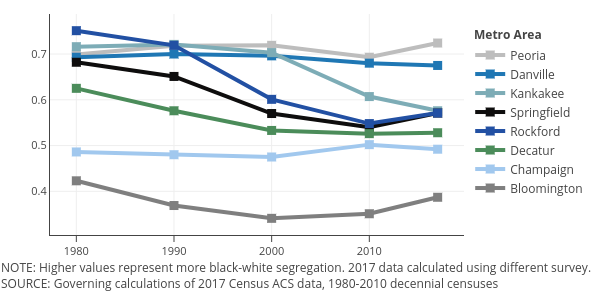
Governing's interactive graph and data of "Peoria, Danville, Kankakee, Springfield, Rockford, Decatur, Champaign, Bloomington" is a , showing Peoria, Danville, Kankakee, Springfield, Rockford, Decatur, Champaign, Bloomington; with Dissimilarity Index in the y-axis. The x-axis shows values from 1977.3044831880447 to 2019.6955168119553. The y-axis shows values from 0.304566480149214 to 0.787433519850786. This visualization has the following annotations: NOTE: Higher values represent more black-white segregation. 2017 data calculated using different survey.; Metro Area; SOURCE: Governing calculations of 2017 Census ACS data, 1980-2010 decennial censuses